Sunday 14 November 2010
Saturday 13 November 2010

Friday 12 November 2010

Thursday 11 November 2010
Wednesday 10 November 2010

Tuesday 9 November 2010

Monday 8 November 2010
Creating A Logo For My Music Magazine
When constructing my magazine I decided that I wanted to create my own logo for my magazine. When researching into music magazines I did not find any that had their own unique logo. The reason I want to create one is so that when it is seen automatically my magazine comes to mind.
 |
| Logo First Draft |
To create my logo I used paint and photoshop. However the skull in the logo is my own drawing. I drew the skull as a starting point for my logo which I then scanned into my computer and later edited. I decided to draw a skull as I think it fits my genre perfectly. Rock music and the whole rock and roll lifestyle is seen to be very dark and mysterious I therefore thought that what symbol better than a skull to use. I also decided to include a guitar plectrum with the word 'rock' on it and also a guitar and amp.
Saturday 6 November 2010
Creating My Masthead
The masthead for my magazine is very important, from my research I have found that the vast majority of mastheads are located at the top left of the page. The reason for this is when magazines are stacked on shop shelfs this is the most viable area for consumers to see the name of the magazine. I therefore have decided that this is where my masthead will be placed. My research has also told me that mastheads tend to be bold and colorful. The colour 'red' is a favourite for many magazines. However I want my masthead to be in keeping with my genre but at the same time be eye catching. Below are eight potential fonts that I have created to use for my masthead.
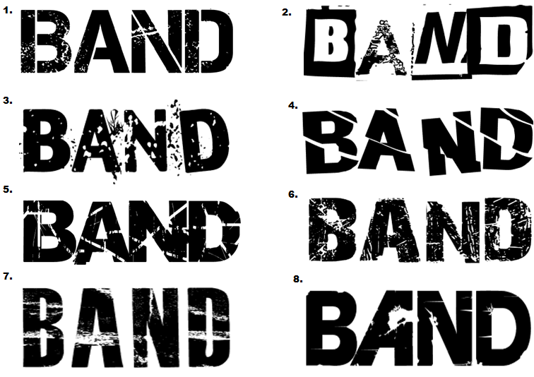
1.) I like this masthead as it is bold and simple but I do not think it would be right to use on my front cover. The army/stamp style font does not really match my theme and genre of rock music this would be more suited to a hip hop or R&B magazine. This font would also work well if used on a light background or as a caption or puff rather than as the masthead. 2.) I really like this masthead because it is different and something that is not commonly used. The miss match of fonts works well together. However the font used on letter 'A' is harder to read and does not match the other fonts and therefore would not suit suit a title. 3.) This is one of my favourite, I really like the effect of the writing. It appears to be 'shattered glass' not only is this masthead unique but it fits my genre of rock music. Rock is perceived to be edgy rebellious so the shattered glass fits perfectly, this would work well. 4.) This masthead is simple yet at the same time it is not boring. Although I do like this masthead I do not think it would be right to use on my cover. The reason for this is I think the lines are too straight and this makes it much harder to read especially from a distance. 5.) This is another favourite of mine, it is bold, eye catching and meets my genre. This masthead is similar to the one used in 'kerrang' The font is broken up using lines and patches this gives it an 'eroded' effect, it looks like it would be found on a rock magazine. 6.) I really like the style of this masthead however I think the intensity of the scratch marks is too high making it hard to read. The masthead could work but it would need to be edited. The contrast could be turned up making it darker this would make it easier to read. 7.) I do not think this would be good as a masthead because the white strips detract away from the name 'BAND' I think that for a masthead to work well it must be bold an eye catching an I don't think that this particular masthead meets this criteria or my rock theme. 8.) I really like how the 'A' is back to front this is unique and if used would be easily recognized and automatically associated with this magazine. However I think that the rest of the masthead is far too plan and therefore would not be eye catching to the consumer.
Friday 5 November 2010
My Edited Photography
Now that I have taken my photographs I need to sort through the best ones and edited some. When it comes to editing I have cropped and rotated as a starting point. I then went on to add a colour wash/filter to change the feel of the picture, for example for some I lowered the saturation which gave it a more urban and bleak feel to match my genre. I also changed the level of brightness and contrast for some of the photographs to make them more vibrant. The applications that I used for editing were Picnik, Tazz, Photoshop and Paint.


Wednesday 3 November 2010
My Photography
I decided to go around my school and take photographs of things that I see everyday. The reason I have done this is so that I am able to get accustom to the camera and start to look at how lighting effects the photograph and different camera shots and angles. Below are a some examples of the photographs I took.


 The next step was to plan the photos that I would need. I thought about appropriate locations where I could take my photos I decided that I would take some local to where I live and some on the school grounds. I took some photos in our school drama studio I thought this was appropriate as I could use the black stage curtains as a back drop, as this what fit my rock genre. I also thought that the drama studio would be an appropriate location as it is equipped with lighting and I would be able to use the lighting to add to the effect of my photographs. The different lights that were available were straw, red, green, yellow and a spot light. When taking photographs for my magazine I wanted to make sure that they were suitable for the type of magazine I focused on the location in detail as I hoped that for some of my photographs I would be able to keep the photographs original background rather than editing in a false image. Notice that in my photographs the backgrounds fit my genre and theme. For example brick walls, metal railings and grass. This gives the image an edgy feel that is common in rock magazines. The photographs tend to be vibrate and show emotion through the models facial expressions. I was creating. I did not want my pictures to be taken in the standard angle. I took a few long shots but mainly took close ups, and medium shots and I used high and oblique angles. I asked my models to wear clothing that resembles the theme of a rock chick; this was achieved using leather, denim and fur items of clothing. I also edited my photographs by cropping and for some I increased the contrast, making the image darker I also highlighted some features such as the red lipstick to add colour to my image. By doing this, it allows me to layer text over my photographs in the same colour creating a completely new colour scheme. Above is a video clip of my before and after shots of a few of my photographs.


View more presentations from katykennedy24.
Tuesday 2 November 2010
My Main Theme
The main theme of my magazine will be rock genre and the images that I am hoping to take will follow this convention. I am planning on photographing my main model to look like a typical model on a music magazine cover. I have decided to fashion her as ‘Taylor Monsem’ This can be seen below (left Taylor, right my model) Overall I hope that my outcome will be similar to one of a typical rock music magazine.

Monday 1 November 2010
My Models
When taking the photographs for my magazine I wanted to ensure that the models were in keeping with the magazine itself. I felt that it was extremely important that the consumers would be able to relate to the images shown throughout the magazine. As I mentioned previously many magazines in current circulation feature 'perfect models' as my target audience are of the younger generation and are therefore more impressionable. I believe it is vital to show them the reality of how people look, rather than mislead them. So when choosing my models I looked at who may be a potential reader of 'BAND' was this way the consumers would be able to automatically connect with the models shown in the magazine. I have chosen two female models even though my magazine is unisex I believe that this will be suitable as the female models will attract male consumers and the female consumers can relate to the models.
Model One -

Name: Helena Shadbolt
Age: 19
Education: University of Birmingham
(English Literature & Drama)
Favourite Bands/Singers: Paramore, Pink & The Pretty Reckless
Model Two -

Name: Nikita Patel
Age: 17
Education: Oaks Park Sixth From
(Drama,History + Government & Politics)
Favourite Band/Singer: Pretty Reckless, Kings Of Leon & Enter Shikari
Subscribe to:
Posts (Atom)