Sunday, 14 November 2010
Saturday, 13 November 2010

Friday, 12 November 2010

Thursday, 11 November 2010
Wednesday, 10 November 2010

Tuesday, 9 November 2010

Monday, 8 November 2010
Creating A Logo For My Music Magazine
When constructing my magazine I decided that I wanted to create my own logo for my magazine. When researching into music magazines I did not find any that had their own unique logo. The reason I want to create one is so that when it is seen automatically my magazine comes to mind.
 |
| Logo First Draft |
To create my logo I used paint and photoshop. However the skull in the logo is my own drawing. I drew the skull as a starting point for my logo which I then scanned into my computer and later edited. I decided to draw a skull as I think it fits my genre perfectly. Rock music and the whole rock and roll lifestyle is seen to be very dark and mysterious I therefore thought that what symbol better than a skull to use. I also decided to include a guitar plectrum with the word 'rock' on it and also a guitar and amp.
Saturday, 6 November 2010
Creating My Masthead
The masthead for my magazine is very important, from my research I have found that the vast majority of mastheads are located at the top left of the page. The reason for this is when magazines are stacked on shop shelfs this is the most viable area for consumers to see the name of the magazine. I therefore have decided that this is where my masthead will be placed. My research has also told me that mastheads tend to be bold and colorful. The colour 'red' is a favourite for many magazines. However I want my masthead to be in keeping with my genre but at the same time be eye catching. Below are eight potential fonts that I have created to use for my masthead.
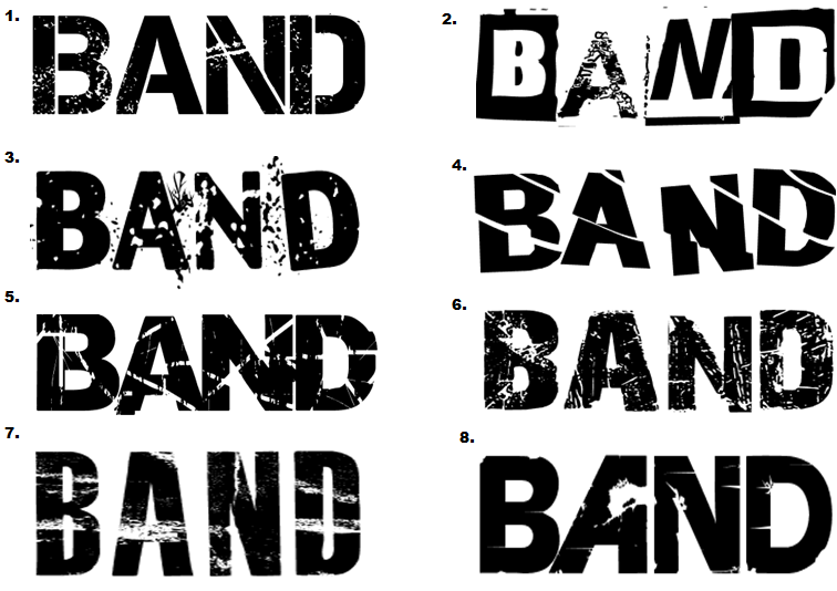
1.) I like this masthead as it is bold and simple but I do not think it would be right to use on my front cover. The army/stamp style font does not really match my theme and genre of rock music this would be more suited to a hip hop or R&B magazine. This font would also work well if used on a light background or as a caption or puff rather than as the masthead. 2.) I really like this masthead because it is different and something that is not commonly used. The miss match of fonts works well together. However the font used on letter 'A' is harder to read and does not match the other fonts and therefore would not suit suit a title. 3.) This is one of my favourite, I really like the effect of the writing. It appears to be 'shattered glass' not only is this masthead unique but it fits my genre of rock music. Rock is perceived to be edgy rebellious so the shattered glass fits perfectly, this would work well. 4.) This masthead is simple yet at the same time it is not boring. Although I do like this masthead I do not think it would be right to use on my cover. The reason for this is I think the lines are too straight and this makes it much harder to read especially from a distance. 5.) This is another favourite of mine, it is bold, eye catching and meets my genre. This masthead is similar to the one used in 'kerrang' The font is broken up using lines and patches this gives it an 'eroded' effect, it looks like it would be found on a rock magazine. 6.) I really like the style of this masthead however I think the intensity of the scratch marks is too high making it hard to read. The masthead could work but it would need to be edited. The contrast could be turned up making it darker this would make it easier to read. 7.) I do not think this would be good as a masthead because the white strips detract away from the name 'BAND' I think that for a masthead to work well it must be bold an eye catching an I don't think that this particular masthead meets this criteria or my rock theme. 8.) I really like how the 'A' is back to front this is unique and if used would be easily recognized and automatically associated with this magazine. However I think that the rest of the masthead is far too plan and therefore would not be eye catching to the consumer.
Friday, 5 November 2010
My Edited Photography
Now that I have taken my photographs I need to sort through the best ones and edited some. When it comes to editing I have cropped and rotated as a starting point. I then went on to add a colour wash/filter to change the feel of the picture, for example for some I lowered the saturation which gave it a more urban and bleak feel to match my genre. I also changed the level of brightness and contrast for some of the photographs to make them more vibrant. The applications that I used for editing were Picnik, Tazz, Photoshop and Paint.


Wednesday, 3 November 2010
My Photography
I decided to go around my school and take photographs of things that I see everyday. The reason I have done this is so that I am able to get accustom to the camera and start to look at how lighting effects the photograph and different camera shots and angles. Below are a some examples of the photographs I took.


 The next step was to plan the photos that I would need. I thought about appropriate locations where I could take my photos I decided that I would take some local to where I live and some on the school grounds. I took some photos in our school drama studio I thought this was appropriate as I could use the black stage curtains as a back drop, as this what fit my rock genre. I also thought that the drama studio would be an appropriate location as it is equipped with lighting and I would be able to use the lighting to add to the effect of my photographs. The different lights that were available were straw, red, green, yellow and a spot light. When taking photographs for my magazine I wanted to make sure that they were suitable for the type of magazine I focused on the location in detail as I hoped that for some of my photographs I would be able to keep the photographs original background rather than editing in a false image. Notice that in my photographs the backgrounds fit my genre and theme. For example brick walls, metal railings and grass. This gives the image an edgy feel that is common in rock magazines. The photographs tend to be vibrate and show emotion through the models facial expressions. I was creating. I did not want my pictures to be taken in the standard angle. I took a few long shots but mainly took close ups, and medium shots and I used high and oblique angles. I asked my models to wear clothing that resembles the theme of a rock chick; this was achieved using leather, denim and fur items of clothing. I also edited my photographs by cropping and for some I increased the contrast, making the image darker I also highlighted some features such as the red lipstick to add colour to my image. By doing this, it allows me to layer text over my photographs in the same colour creating a completely new colour scheme. Above is a video clip of my before and after shots of a few of my photographs.


View more presentations from katykennedy24.
Tuesday, 2 November 2010
My Main Theme
The main theme of my magazine will be rock genre and the images that I am hoping to take will follow this convention. I am planning on photographing my main model to look like a typical model on a music magazine cover. I have decided to fashion her as ‘Taylor Monsem’ This can be seen below (left Taylor, right my model) Overall I hope that my outcome will be similar to one of a typical rock music magazine.

Monday, 1 November 2010
My Models
When taking the photographs for my magazine I wanted to ensure that the models were in keeping with the magazine itself. I felt that it was extremely important that the consumers would be able to relate to the images shown throughout the magazine. As I mentioned previously many magazines in current circulation feature 'perfect models' as my target audience are of the younger generation and are therefore more impressionable. I believe it is vital to show them the reality of how people look, rather than mislead them. So when choosing my models I looked at who may be a potential reader of 'BAND' was this way the consumers would be able to automatically connect with the models shown in the magazine. I have chosen two female models even though my magazine is unisex I believe that this will be suitable as the female models will attract male consumers and the female consumers can relate to the models.
Model One -

Name: Helena Shadbolt
Age: 19
Education: University of Birmingham
(English Literature & Drama)
Favourite Bands/Singers: Paramore, Pink & The Pretty Reckless
Model Two -

Name: Nikita Patel
Age: 17
Education: Oaks Park Sixth From
(Drama,History + Government & Politics)
Favourite Band/Singer: Pretty Reckless, Kings Of Leon & Enter Shikari
Sunday, 31 October 2010
Camera Angles & Shot Research
Camera Angles
Camera angles are used to position the viewer so that they can understand the relationships between the characters.
A bird's eye angle: is an angle that looks directly down upon a scene. This angle is often used as an establishing angle, along with an extreme long shot.
A high angle: is a camera angle that looks down upon a subject. A character shot with a high angle will look vulnerable or small. These angles are often used to demonstrate to the audience a perspective of a particular character.
An eye-level angle: puts the audience on an equal footing with the characters. This is the most commonly used angle in most films as it allows the viewers to feel comfortable with the characters.
A low angle:is a camera angle that looks up at a character. This is the opposite of a high angle and makes a character look more powerful. This can make the audience feel vulnerable and small by looking up at the character. This can help the responder feel empathy if they are viewing the frame from another character's point of view.
A canted angle: is used to demonstrate the confusion of a character the aim is to disorient you as the audience.
Before going out and taking my photographs I had to look into camera shots. There are many different types of camera shots that convey different messages.
Camera Shots
Extreme long shot: So far away from the subject that they are barley visible, often used as an establishing shot.
Very wide shot: The subject is visible but emphasis is remains on the surrounding environment.
Wide shot: The subject takes up the majority of the frame, head to toe.
Mid shot: Shows the subject in more detail but tends to be cut of at the waist.
Medium close up: This is half way between a mid shot and a close up.
Over the shoulder shot: Looking at one subjects over the shoulder of another.
Close up: A certain feature of the subject takes up the whole frame.
Two shot: A shot of two people, framed similarly to a mid shot.
Point of view shot: A view from the subjects perspective
Extreme close up: Shows an area of the subject in great detail, taking up the whole frame.

Saturday, 30 October 2010
Target Audience
After annotating two existing music magazines it was time for me to think bout my target audience. I found that most of these magazines are aimed at teenagers. I therefore decided that my magazine would be aimed at teenagers aged sixteen to nineteen. I also decided to create a survey to give to my target audience, the reason I did this was to gather feedback that I could possibly use when creating my music magazine.The average reader for 'BAND' would be a male/female teenager that would tend to listen to their ipod a lot, whether it be while out and about or at home relaxing. As my magazine follows the rock/indie genre the average reader would most likely attend concerts such as 'Reading' and 'V' and be interested not only in signed artists but up an coming artists and unsigned bands. I would need to take into consideration the amount of money that my average reader would have when deciding on the cost of my magazine.
 |
| My Online Survey Given To My Target Audience |
Colour Palette

Mood Board

Above is a mood board that I have created. Within the mood board are key features that I want my magazine to include. I have added another colour palette, an MTV logo. The reason I have added this logo is because I want to ensure that my magazine appeals to the same target audience as mtv. I have also added two pictures of Taylor Momsen she is the perfect rock chick in the music industry today. The mood board also includes some classic rock bands. Now that I know my genre is rock I need to start to think about the magazines colour scheme especially for the front cover. Typically rock is associated with dark and dull colours such as black and grey. When thinking about a colour scheme for my cover I created a colour palette of possible colours that I could use.
Starting To Create My Music Magazine
Now that my music magazine research is done and I have completed my preliminary task I am ready to start thinking about my main task. I created a brainstorm of ideas to help me create my music magazine.

After creating this brainstorm I decided that the genre of my magazine would be rock music and that the title of my magazine would be called 'BAND' this is a fairly simple name however I feel that it is straight to the point and fits the style of my magazine well, as my magazine will mainly focus on rock bands. It also meets my criteria of being a unisex magazine. I would like my target audience for 'BAND' to be both male and female aged roughly 16-21. I will therefore need to ensure that I create my magazine to attract the readers in this age category.
Friday, 29 October 2010


Thursday, 28 October 2010
Contents Page Analysis

Yet again the layout is fairly simple and basic. Notice that the colour scheme has been carried through to the contents page. This is very common in most magazines as it links with the genre and the overall theme. As it is so basic the main image influences the feel of the page as it is in black and white. This adds to the effect and reinforces to the reader that the genre is rock.I like how the date is shown at the top left of the page, this is uniques as most magazine do not show the date on the contents page but only on the front cover. Also on the bottom left is a box that says 'regulars' this is also a good idea for consumers that often buy this magazine they will be able to fins exactly what they are looking for straight away.
Feature Article Analysis

Once again the colour scheme is carried through. The colour scheme would not be carried on throughout the entire magazine, but defiantly on the cover,contents and main article. This is something to bare in mind when constructing my music magazine. The images on this article are no longer black and white but in more of a sepia effect. This adds some more colour to the page and gives it more life. The main bulk of text is white and placed on top of a black background. This makes it much easier to read an more aesthetically pleasing to the eye. However when looking twice at the text itself there is not much, even though it is a double page spread the majority of both pages if filled up with pictures. This suggests to me that maybe the article is continued on the next page of the magazine.
Font Cover Analysis


Wednesday, 27 October 2010
Existing Magazine Analysis - Cover 1
As part of my research I have decided to take three existing music magazines to analysis and look into. The reason that I have done this is to see the key codes and conventions of a music magazine, in order to help me create my magazine to look professional.

Friday, 8 October 2010
Magazine Research
The main part of my coursework is to create a music magazine so I am going to research into two music magazines that are currently on sale in England. Kerrang has been published on a weekly basis sine June 7th 1981. The magazine mainly focuses on the genre of British heavy metal. A typical issue of Kerrang is around sixty-three pages long and features bands such as Paramore and Slipknot. After the contents page the magazine tends to start with a 'feedback' section, of all the readers emails and questions. Followed by feature articles and interviews. Karrang also dedicate a section to informing readers of up and coming concerts and album releases called 'Gig Guide'. In addition to this towards the end of the magazine are posters, competition and advertisement pages. Between January 1st 2010 - June 30th 2010 Kerrang sold 37,119 single copy sales at basic cover price in the United Kingdom and the Republic of Ireland. http://www.abc.org.uk/Certificates/16862131.pdf The average reader of Kerrang is aged 17-20, although this is a uni sex magazine the majority of readers for Kerrang are male. The layout of the magazine is very traditional and clear, starting with a contents page, leading on to articles and finishing with adverts quiz's and competitions.
Wednesday, 6 October 2010
Research Into Fonts
Before creating my magazine, I have decided to research the most common fonts used in product design. Through internet resources, I have found that the top seven fonts used with media and design are the following:
· Helvetica
· Trajan
· Garamond
· Futura
· Bodoni
· Bickham Script Pro
· Frutiger
These fonts are just a few of the fonts used within the media. These fonts are so important as by simply looking at the font you can automatically recognise where it is from. An example of this is Baskerville old face font, this is the font used for Vogue magazine. It is also very important that the consumer can read the font without struggling for example some fonts such as 'Brush Script MT' would work well as a title or sub heading but not when used for large amounts of texts.
Tuesday, 5 October 2010
Colour Analysis
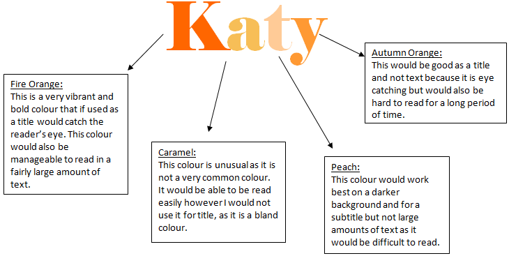
I have researched the basics about colours and have now decided to create some colours of my own. I have used my name as a tester for each colour. I have used the same basic colour but I have varied the brightness resulting in a form of palette. Below are my testers along with a brief description.


Research Into Colours
The colour that the font is written in can also play an important role within the media along with the symbol/image used. Here are a few common loges that are recognised for both their font and colour.

These very common logo’s that are known worldwide. As you can see these logos are very simple and plain, they tend to only use two key colours. Both the O2 and McDonald’s logo’s are simple and extraordinarily plain but yet everyone knows what they are. The McDonald’s logo is also known as the golden arches. Magazines do not tend to have their own logos however they do feature the logos of other brands that they associate with. Therefore when creating my magazine I may want to consider doing so. When looking at rock and indie magazines it is clear to see that they majority follow the same colour theme. The main colours these magazines use are red, white, black, grey an yellow. Within the media different colours represent different things and have a desired effect.
Red - is the colour of blood, and so it is associated with, war, danger, strength, power, as well as passion, desire, and love. It is a very intense colour, red is often used on road signs as it's visibility is very clear. It tends to bring text to the foreground. Many 'Buy Now' and 'Click Here' signs are written in red as it grabs attention and decisions are made quicker.
Yellow - Yellow is the mostly associated with sunshine. The colour yellow represents joy, happiness and energy to most people. It is a warm and vibrant colour, bright yellow grabs attention, which is the reason taxicabs are painted this colour. However the colour yellow is also used as a warning eg. chemical substances. Yellow is used to give off pleasant and cheerful feelings. Most perceive yellow as a very light hearted, 'childish' colour. Yellow is best used on darker backgrounds, as when used on backgrounds such as white it is straining on the eye as it blends in too much.
Black - Black tends to be associated with power, elegance, death, evil, and mystery. Most find black a mysterious colour associated with fear and the unknown and is therefore perceived as a negative colour. Black indicates strength and authority it is considered to be a very formal. If used on posters or in a gallery it allows other colours on the image to stand out more. Black contrasts well with bright colours such as red. Black is actually not a colour in itself, but the absence of colour.
White - White is often associated with light, goodness, innocence and purity. It is considered to be the colour of perfection. It often represents cleanliness and opposed to black it usually has a positive connection. When it comes to advertising white is used to suggest simplicity in high-tech products. White is associated with hospitals, doctors, and sterility, so white could be used to suggest safety when promoting medical products.
Representation Of Gender
Within the media gender plays a big part, especially when it comes to magazines. The females in magazines tend to be stereotypes of ‘perfect women’ when the reality is that the majority of women do not look like how these magazines perceive them too. This is a very controversial subject as many believe that it is unacceptable to encourage young girls to look like these women as the reality is, although they look perfect they are in fact very unhealthy. Some of these female models used are underweight and suffer from both the mental and physical effects caused by bulimia and anorexia. These images of women sell everything from food to cars. Many believe that the models and celebrity’s are role models to most teenage girls and should not be setting this example. The fact of the matter is that the majority of the magazines are based on fashion yet the whole persona seems to be on the models. Many would also argue that women are degraded when featured in ‘lad’s mags’. The idea of women in tasteless magazines, teaches young males that is ok to idolise women in this way. I personally believe that women should feature in magazines in a classy way. As a young adult myself I know that many young girls look up to the women in these magazines and aspire to one day look like them. These magazines seem to be influential but in a negative way, I would like to these magazine influence girls in a positive way. This could be done but using models that are of a healthier size and weight. Although there are also these problems in male magazines it is much more obvious within female magazines this could also be because on average women buy more magazines than males. The males in boys magazines such as ‘fitness’ are toned, tanned and trained. Whereas the average man does not have a six-pack. This encourages boys to train and work hard to look like these men. However there are many risks with this, some may lead to steroids and other substances just to look these picture perfect models. As far as gender is concerned women are known for fashion and looking like this thin gorgeous models and males are associated with being interested in cars, sports and fitness.
Monday, 4 October 2010


Subscribe to:
Posts (Atom)