Tuesday, 8 March 2011

Evaluation: Q7: Looking back at your preliminary task, what do you feel you have learnt in the progression from it to the full product?

Since creating my school magazine as my preliminary task I feel that my knowledge of using Photoshop has increased to a level where I feel comfortable using it. For example I now know how to select parts of photos using the selection tool in order to cut things out. For example any images where I have used a separate background. I also feel that my photography skills have improved. The first time around I found it harder to take pictures while thinking about the mise-en-scene however with practice I feel that my photography dramatically improved during my main task. I also feel that I am now able to manage my time much more efficiently and able to prioritise which work needs to be done first. I feel that I would now be able to produce a production schedule which would allow me to follow week by week tasks and complete the work within a shorter amount of time. Overall my understanding of the software has improved throughout this coursework I now feel that I have produced a professional looking magazine using these software’s.


Above are both the cover and contents of my preliminary task and my main task. I feel that the difference is clearly visible as to which is which, and I am happy with how my work has changed from my initial out come to my final product.

Evaluation:Q6: What have you learnt about technologies from the process of constructing this product?

Below is a list of the different program's and equipment that I used in order to create, edit and present my product. Overall I have learnt a lot about technology throughout this project. Before creating my magazine I'd never used Slide share, Photobucket, Flickr, Blogger or many of these media softwares. However I now feel comfortable using the cutting tool, which I used to edit round my downloaded fonts and some images on my magazine such as my logo. I now feel that I am able to use the technologies to the best of my ability and that I am able to be more adventurous with the way in which I actually use each tool. I look forward to developing these new skills in the future.

Evaluation: Q5: How did you attract/address your audience?


I addressed my target audience whilst creating my actual product to ensure I was covering all area’s that they would like to be in a new rock music magazine. I have carried out numerous questionnaires to get feedback for my magazine. I also created a post questionnaire to see what I could have improved on, this was not only a good way to find out what people thought about my magazine but also to help me in the future. I attracted my audience by using images that they felt they could relate to and I also used colours such as 'red' to grab their attention. This was important as when the magazine is on the shop shelf surrounded by similar products it is vital that my magazine would stand out over the rest. I also ensued that I placed my masthead at the top of my magazine so that it was easily visible to my target audience.


I have also addressed my target audience in other ways such as the use of props, costume and colour this not only allows me to clearly show my genre and identify much target audience but it also attracts my audience as they can relate to the images they can see. For example on my cover the clothing is typical of a rock artist and therefore follows conventions of a music magazine. I have also created my models makeup to be typical of a model found on a music magazine such as NME or Kerrang.

The colour also helps to attract my target audience I have used the colour ‘red’ over black and white this create a nice effect that allows the red to stand out without being over powering. It was important that my cover stood out as typically the consumer would pick up the most aesthetically pleasing magazine on the shelf. I also used superlatives on my magazine. Superlatives are signs or symbols that attract the consumer to the magazine, for example 'NEW' or ‘DON’T MISS’ these immediately make the magazine look interesting. 

Evaluation: Q4: Who would be the audience for your media prodcut?


Whilst creating my actual product I was following the conventions of a typical rock magazine and basing my target audience around the age of sixteen plus. I tried to allow my target audience to be both male and female. Although the images used in my magazine are of females I feel that this is still appropriate as, females can relate to the images and males are attracted to the images shown. I have tried to ensure the style and language used throughout my product is neither feminine nor masculine. My typical target audience would be those who enjoy going to gigs and festivals such as ‘download’ and ‘V’ they would like listening to music on the go using things such as an ipod. They would mainly spend free time with friends out and about and spend most of their spare money on music and band T-shirt’s. I had to ensure that my magazine appealed to my target audience as a whole although the age band of my target audience is fairly small the likes and dislikes between these age groups can vary. Typically the lower end of my target audience would spend the day at school/college and then in their spare time, enjoy using their computer/laptop to listen to music and communicate through social networking sites such as facebook or myspace. However towards the end of my target audience age range the teenagers may be or likely to actually attend gigs and concerts as they can now afford to. I therefore ensured that I included different features to suit each ages needs. For example I included free posters of bands within my magazine, this would mainly appeal to the lower age as they would be more likely to hang such posters on their bedroom walls. I also included an up and coming gig line up in my magazine for the upper end of my audience as this would be useful to them. Below is some example images of my target audience.


Evaluation: Q3: What kind of media institution might distibute your media product and why?


My product would be distributed as a hard copy and would be available to purchase from supermarkets, newsagents and record stores. My product would be sold in a record store as they tend have a wide variety of products like mine. This is also a prime area for my target audience. However so that I am not restricting my product to much I would also sell my product in some supermarkets such as Tesco. This for most is a fairly accessible shop to purchase from. This also matches my cover price. My cover price being £2.50 is reasonable when purchased from shops such as this. I would also create a ‘BAND’ website where my consumers could find out when the next issue will be released and what the content will be. By creating this page it will create more awareness’ of my magazine and appeal to a wider market, therefore increasing my profit.  I think that IPC Media would be good to distribute my media product as they are very successful with distributing magazines such as NME. When researching into institutions I came across this rather impressive statement on the ipc website.  ‘IPC Media produces over 60 iconic media brands, with print alone reaching almost two thirds of UK women and 42% of UK men – almost 26 million UK adults – while our websites collectively reach over 20 million users every month.’ I therefore think this will be good to use as my magazine is similar to NME however our target audiences are different and there would therefore be the necessary gap in the market for my product. 

Evaluation: Q2: How does your media product represent particular social groups?


Before creating my magazine I had decoded that my target audience would be age between sixteen to nineteen. Typically they would tend to listen to music whenever possible whether it be while out and about or at home relaxing. As my magazine follows the rock/indie genre the average reader would most likely attend concerts such as 'Reading' and 'V' and be interested not only in signed artists but up an coming artists and unsigned bands. I would need to take into consideration the amount of money that my average reader would have when deciding on the cost of my magazine.

When thinking about my creating my magazine I decided to look at an existing rock star. From my own knowledge I knew of a female rock singer called 'Taylor Momsen' I decided to take pictures that resemble her style. When choosing my models I thought carefully about how I wanted to take my images. The images that I actually took were of a friend of mine. The reason that I decided to use her was because I felt that she was photogenic and could take relatively similar photographs as Taylor Momsen. I tried to create an image that my target audience could relate to, I therefore thought about the social stigma attached to the 'rock' genre. This tends to be edgy and out there, so when taking my photographs I decided it would be a good idea to dress my model in this style. I did this using fur, leather and denim clothing. I felt this would be a good idea as the target audience I am aiming my product on would also be the type of teenagers that would dress this way and have their own identity. In the pictures above is an example of this, one the left is Taylor Momsen and on the right is my model. I have also made sure that my outcome represents particular social groups by looking at one specific genre of music. However although my genre of music is rock I have manipulated this so that my target audience will range from fans of rock, indie and even heavy metal. The reason I did this was to ensure that my target audience was specific enough to create my magazine to meet their needs yet at the same time not narrowing it down too much so that my profit margin would be too small. I did this by using dark colours such as black and grey within my magazine, the reason I did this is because these are the colours generally associated with this social group of rock fans. This will therefore attract the right audience to magazine near enough straight away. The style of writing I have followed is also conventional as this is a key part of the magazine. My genre can easily be identified by the font and style of writing used throughout my magazine. If I had followed an unconventional style of writing for example if my writing was too formal, this would overall put me at a disadvantage as my target audience would not purchase my product, and the amount of consumers would deteriorate having a detrimental effect on my business.

Evaluation


Evaluation: Q1: In what ways does your media product use, develop or challenge the forms 
and conventions of a

For my media I have created a music magazine that consists of a front cover, contents page and a features article. As I had chosen the genre of 'rock' I looked at other music magazines of the same genre and listed the conventions. This allowed me to follow these conventions and base my own magazine around them. My media outcome both develops and challenges the conventions a real rock music magazine. I did this by paying attention to detail. However I have also challenged some of these conventions by looking at magazines of another genre an incorporating those conventions into my magazine. Overall my outcome follows most of the rock conventions however when creating this final outcome I went against these conventions and used some unconventional ideas to play around with and see how they worked. I have tried to make it clear what conventions I have or haven’t followed throughout my work. For example typically a rock magazine would have minimal colour and be overall very dark and plain. I have incorporated this in some aspects of my work; however I have also gone against this in a sense. My front cover is generally lighter than one you would expect to see from a rock magazine. The reason I have done this is to attract a slightly wider market with the use of colour, in the other hand I am still managing to tare\t my original audience as I have only used red, grey, white and black on my cover. I have continued this colour theme across my contents and features article to ensure that the continuity if the magazine is persistent. I was careful doing this as I did not want the pages to look to similar, I therefore used different shades of these colours on each page. I decided to name my magazine 'BAND' as this pretty much sums up the content of my magazine. I liked this name as it was short and very easy to remember.

From my research I have noticed that many big name music magazines have also got short title names, for example NME, MOJO and Q magazine. This again follows the conventions. The font that I have used was one that I downloaded from an online website called 'Dafont' I feel that the font I have used fits the appearance and vibe that I would like to give to my target audience. The effect of the font is bold, edgy and looks wore. I feel that this meets the general conception of a rock music magazine. The typical rock magazine contents is full up. I have incorporated this into my work and used various pictures and text to fill the page however I have also gone against this and used brighter colours on my contents page, which is unconventional for this genre. The background for example is white 5thius is very unusual for a rock magazine as they tend to be black white text layered on top. The overall layout of my magazine is also very similar to the one of a genuine rock magazine I felt that this was essential. The reason for this is my target audience would be familiar with this layout and find it easier to understand. The actual image on my cover is fairly unconventional in the sense that although my model looks to be a rock singer, the photograph itself is taken in a particular poise that some may see as a fashion style. My image is of one female alone, which in itself is not conventional. Many magazines feature an image of one person 0on the cove, however rock/music magazine have a tendency to feature bands on their covers. The reason I have gone against this is to ensure my cover is not too over powering and 'in the face' I felt that the image I have used not only meets my genre and appeals to my target audience but also allows me to add more text onto my cover as the subject does not take up the whole frame. My features article is most conventional as it follows the layout of a genuine music magazine and the style of writing also is the same. This is vital as my readers will need to be able to relate to the story.

Monday, 8 November 2010

Creating A Logo For My Music Magazine

When constructing my magazine I decided that I wanted to create my own logo for my magazine. When researching into music magazines I did not find any that had their own unique logo. The reason I want to create one is so that when it is seen automatically my magazine comes to mind. 
Logo First Draft
To create my logo I used paint and photoshop. However the skull in the logo is my own drawing. I drew the skull as a starting point for my logo which I then scanned into my computer and later edited. I decided to draw a skull as I think it fits my genre perfectly. Rock music and the whole rock and roll lifestyle is seen to be very dark and mysterious I therefore thought that what symbol better than a skull to use. I also decided to include a guitar plectrum with the word 'rock' on it and also a guitar and amp. 

Saturday, 6 November 2010

Creating My Masthead

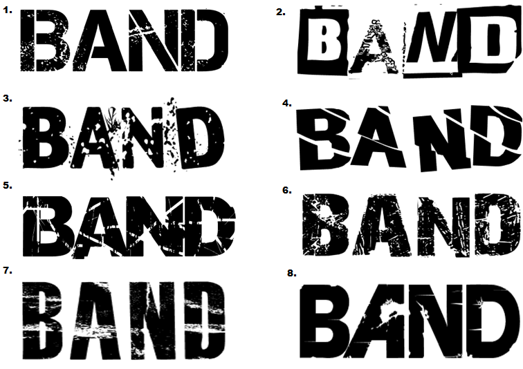
The masthead for my magazine is very important, from my research I have found that the vast majority of mastheads are located at the top left of the page. The reason for this is when magazines are stacked on shop shelfs this is the most viable area for consumers to see the name of the magazine. I therefore have decided that this is where my masthead will be placed. My research has also told me that mastheads tend to be bold and colorful. The colour 'red' is a favourite for many magazines. However I want my masthead to be in keeping with my genre but at the same time be eye catching. Below are eight potential fonts that I have created to use for my masthead. 
Analysis of the above mastheads -
1.) I like this masthead as it is bold and simple but I do not think it would be right to use on my front cover. The army/stamp style font does not really match my theme and genre of rock music this would be more suited to a hip hop or R&B magazine. This font would also work well if used on a light background or as a caption or puff rather than as the masthead. 2.) I really like this masthead because it is different and something that is not commonly used. The miss match of fonts works well together. However the font used on letter 'A' is harder to read and does not match the other fonts and therefore would not suit suit a title. 3.) This is one of my favourite, I really like the effect of the writing. It appears to be 'shattered glass'  not only is this masthead unique but it fits my genre of rock music. Rock is perceived to be edgy rebellious so the shattered glass fits perfectly, this would work well. 4.) This masthead is simple yet at the same time it is not boring. Although I do like this masthead I do not think it would be right to use on my cover. The reason for this is I think the lines are too straight and this makes it much harder to read especially from a distance. 5.) This is another favourite of mine, it is bold, eye catching and meets my genre. This masthead is similar to the one used in 'kerrang' The font is broken up using lines and patches this gives it an 'eroded' effect, it looks like it would be found on a rock magazine. 6.) I really like the style of this masthead however I think the intensity of the scratch marks is too high making it hard to read. The masthead could work but it would need to be edited. The contrast could be turned up making it darker this would make it easier to read. 7.) I do not think this would be good as a masthead because the white strips detract away from the name 'BAND' I think that for a masthead to work well it must be bold an eye catching an I don't think that this particular masthead meets this criteria or my rock theme. 8.) I really like how the 'A' is back to front this is unique and if used would be easily recognized and automatically associated with this magazine. However I think that the rest of the masthead is far too plan and therefore would not be eye catching to the consumer.

Friday, 5 November 2010

My Edited Photography

Now that I have taken my photographs I need to sort through the best ones and edited some.  When it comes to editing I have cropped and rotated as a starting point. I then went on to add a colour wash/filter to change the feel of the picture, for example for some I lowered the saturation which gave it a more urban and bleak feel to match my genre. I also changed the level of brightness and contrast for some of the photographs to make them more vibrant. The applications that I used for editing were Picnik, Tazz, Photoshop and Paint. 


Wednesday, 3 November 2010

My Photography

I decided to go around my school and take photographs of things that I see everyday. The reason I have done this is so that I am able to get accustom to the camera and start to look at how lighting effects the photograph and different camera shots and angles. Below are a some examples of the photographs I took.


 The next step was to plan the photos that I would need. I thought about appropriate locations where I could take my photos I decided that I would take some local to where I live and some on the school grounds. I took some photos in our school drama studio I thought this was appropriate as I could use the black stage curtains as a back drop, as this what fit my rock genre. I also thought that the drama studio would be an appropriate location as it is equipped with lighting  and I would be able to use the lighting to add to the effect of my photographs. The different lights that were available were straw, red, green, yellow and a spot light. When taking photographs for my magazine I wanted to make sure that they were suitable for the type of magazine I focused on the location in detail as I hoped that for some of my photographs I would be able to keep the photographs original background rather than editing in a false image. Notice that in my photographs the backgrounds fit my genre and theme. For example brick walls, metal railings and grass. This gives the image an edgy feel that is common in rock magazines. The photographs tend to be vibrate and show emotion through the models facial expressions. I was creating. I did not want my pictures to be taken in the standard angle. I took a few long shots but mainly took close ups, and medium shots and I used high and oblique angles. I asked my models to wear clothing that resembles the theme of a rock chick; this was achieved using leather, denim and fur items of clothing. I also edited my photographs by cropping and for some I increased the contrast, making the image darker I also highlighted some features such as the red lipstick to add colour to my image. By doing this, it allows me to layer text over my photographs in the same colour creating a completely new colour scheme. Above is a video clip of my before and after shots of a few of my photographs.


Tuesday, 2 November 2010

My Main Theme


The main theme of my magazine will be rock genre and the images that I am hoping to take will follow this convention. I am planning on photographing my main model to look like a typical model on a music magazine cover. I have decided to fashion her as ‘Taylor Monsem’ This can be seen below (left Taylor, right my model) Overall I hope that my outcome will be similar to one of a typical rock music magazine.

Monday, 1 November 2010

My Models

When taking the photographs for my magazine I wanted to ensure that the models were in keeping with the magazine itself. I felt that it was extremely important that the consumers would be able to relate to the images shown throughout the magazine. As I mentioned previously many magazines in current circulation feature 'perfect models' as my target audience are of the younger generation and are therefore more impressionable. I believe it is vital to show them the reality of how people look, rather than mislead them. So when choosing my models I looked at who may be a potential reader of 'BAND' was this way the consumers would be able to automatically connect with the models shown in the magazine. I have chosen two female models even though my magazine is unisex I believe that this will be suitable as the female models will attract male consumers  and the female consumers can relate to the models.

Model One -

Name: Helena Shadbolt
Age: 19
Education: University of Birmingham 
(English Literature & Drama)
Favourite Bands/Singers: Paramore, Pink & The Pretty Reckless

Model Two -

Name: Nikita Patel
Age: 17
Education: Oaks Park Sixth From 
(Drama,History + Government & Politics)
Favourite Band/Singer: Pretty Reckless, Kings Of Leon & Enter Shikari

Sunday, 31 October 2010

Camera Angles & Shot Research

Camera Angles

Camera angles are used to position the viewer so that they can understand the relationships between the characters. 
bird's eye angle: is an angle that looks directly down upon a scene. This angle is often used as an establishing angle, along with an extreme long shot.
high angle: is a camera angle that looks down upon a subject. A character shot with a high angle will look vulnerable or small. These angles are often used to demonstrate to the audience a perspective of a particular character. 
An eye-level angle: puts the audience on an equal footing with the characters. This is the most commonly used angle in most films as it allows the viewers to feel comfortable with the characters.
low angle:is a camera angle that looks up at a character. This is the opposite of a high angle and makes a character look more powerful. This can make the audience feel vulnerable and small by looking up at the character. This can help the responder feel empathy if they are viewing the frame from another character's point of view.
canted angle: is used to demonstrate the confusion of a character the aim is to disorient you as the audience.
Before going out and taking my photographs I had to look into camera shots. There are many different types of camera shots that convey different messages. 

Camera Shots
Extreme long shot: So far away from the subject that they are barley visible, often used as an establishing shot. 

Very wide shot: The subject is visible but emphasis is remains on the surrounding environment.
Wide shot: The subject takes up the majority of the frame, head to toe.
Mid shot: Shows the subject in more detail but tends to be cut of at the waist.
Medium close up: This is half way between a mid shot and a close up.
Over the shoulder shot: Looking at one subjects over the shoulder of another.
Close up: A certain feature of the subject takes up the whole frame. 
Two shot: A shot of two people, framed similarly to a mid shot.
Point of view shot: A view from the subjects perspective
Extreme close up: Shows an area of the subject in great detail, taking up the whole frame.